Topps 2011 First Impressions
I don't believe that you can ever really tell whether or not you'll like a set from a photo, I think that you have to hold the things in your hand and open some packs before you can really give an accurate assessment of the product. So with that in mind I didn't post anything about the sell sheets for this year's Topps flagship, rather I waited until the new product hit stores. And hit it has. My local Target had a box of rack packs and at least three gravity feed packs. I managed to snake a one each. While I wasn't thrilled with my pulls, there some solid cards in there, which I'll be highlighting as well as giving my opinion on each of the inserts that I received.
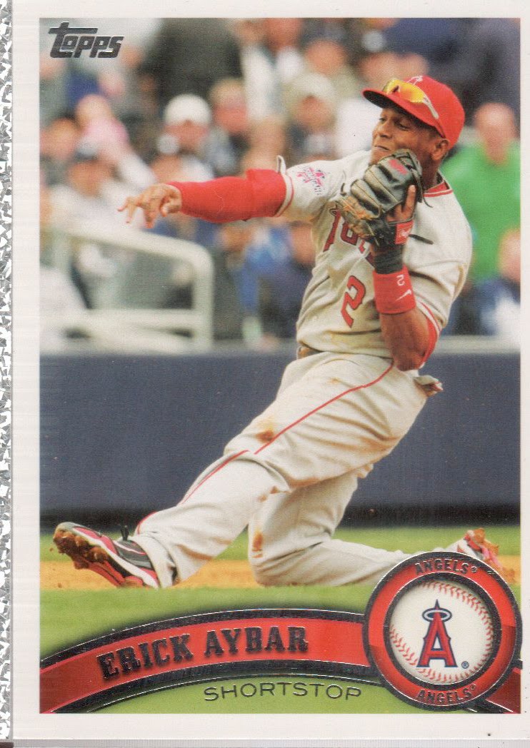
I chose Erick Aybar here for the main card design example because he was my only Halo in two packs. I have to say, I really like this design. It has the classic elements that all good cads must have, including the official MLB logo, and it's color coded. My only major issue is that there's too much foil, but this has been the case with every set of Topps since I can remember. Here the foil is fairly attractice, but the smaller text is awfully hard to read. Also make sure you pay attention to the space above the name frame, some cards have "flavor text" there, such as denoting who the 2010 ROYs were, or a superlative like "first to 600 saves" (for Trevor Hoffman).
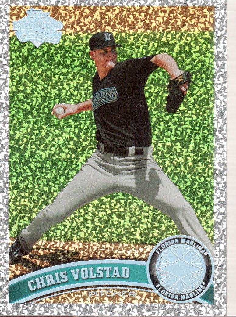
There are three parallel sets that I can see from the wrapper. Most folks will never see the Platinum Parallels or the Canary Diamond Parallels which are 1:9,200/1:27,000 (rack odds/retail pack odds). However, most people will pull a ton of these "Diamond Anniversary" foils which are 1:4 in retail and not listed on the Rack, though they are advertised on the front. These aren't serial numbered, which I think is a shame, but they are awfully shiney. I like shiney.

The ubiquitous 'gold' parallels are serially numbered to 2011 and are a bit harder to come by at retail falling 1:5/1:17 . Here's the back of the one I pulled. I really like the fact that they actually put a space in the design as to where the serial numbering is supposed to go. I also like that they're still using the same font/type for the serial number as they've used in years past. Continuity is important you know.

Diamond Duos are this year's version of Legendary Lineage. After awhile the LL cards really bored me, and I have no doubt these will as well. On the back are listed some comparison stats and a brief blurb, but they really aren't all that special. They are numbered with the initials of the player's depicted, so this Boggs/Youklis is # "DD-BY". I hate that. They are also being produced as a relic edition. They're 1:4 in retail packs and unlisted in Racks. The relic edition is 1:3460/1:10,500.

This set is called Topps 60 and has the obligatory Mickey Mantle that no modern collector needs at this point. These are also 1:4 in retail and not listed in racks, but since I got one in each, I'm guessing they're 1:1 in racks.
Part 2 will have the rest of my review.
2 comments:
I like the look of those shiny diamondish cards too.
Yeah, if I were ever tempted to put together a full parallel set of something (and believe me, I've never been tempted) that would be it. I love the shiney.
Post a Comment